
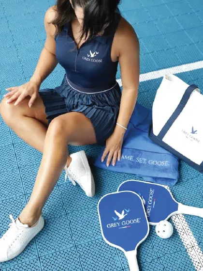
GREY GOOSE
AUSTRALIAN OPEN
To celebrate GREY GOOSE’S brand relationship with the Australian Open, we created the Lemon Ace cocktail design. The sparkling lemon drink is the perfect serve for the event.
A lightweight aluminium can was the ideal material, chosen for its recyclability and designed to resemble the many tubes of tennis balls used throughout the tournament.


The blue colourway with white stripes connects to the Australian Open’s iconic court markings. The lemon-yellow accent colours link to the tennis balls. We also designed how the serve would look in the serve glass, with a lemon garnish that feels like a tennis ball topping.


The branding was carefully considered to generate maximum shareability online. The orientation of the can design ties into the court aesthetic, and attendees hold the base of the can to snap pictures of themselves enjoying a drink against the court backdrop.
This leaves the GREY GOOSE brand lock-up highly visible at the top of the can, allowing the consumers to generate hundreds of thousands of online impressions – making the can itself the catalyst of an organic consumer-generated campaign that represents the aspirational, sophisticated conviviality of the brand.


The tournament is known as the ‘happy slam’ because of its joyful approach to tennis. The playfulness of our concept represents this attitude perfectly.


